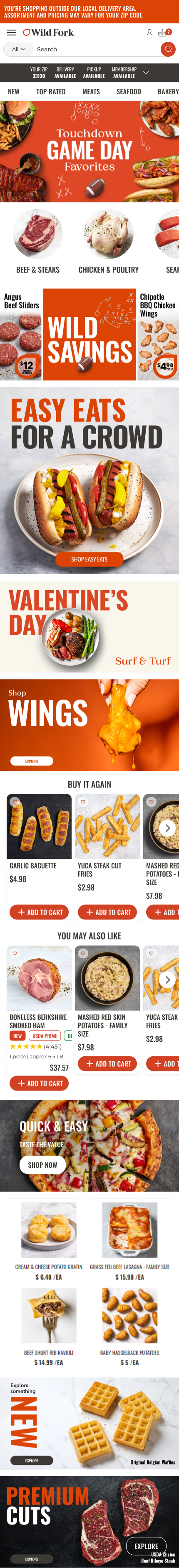
Personalized Homepage
Wild Fork is an eCommerce site specializing in high-quality meat and seafood, averaging 39K sessions daily. They offer a range of products from budget-friendly options to premium cuts.
The Problem
Wild Fork’s previous homepage treated all users the same, regardless of their familiarity with the brand. Usability testing and Hotjar findings revealed key differences in how new and returning users engaged with the site:
New Users sought information about Wild Fork’s unique value proposition before feeling ready to make a purchase.
Returning Users wanted to quickly find products and explore new offerings rather than re-engage with introductory content.
A one-size-fits-all homepage was not effectively serving either user group, leading to unnecessary friction in the shopping experience and missed conversion opportunities.
The Goal
The goal of this redesign was to personalize the homepage experience based on user segments:
New Users: Provide company information first, then introduce product categories and customer reviews.
Returning Users: Prioritize product discovery with quick navigation to categories, marketing campaigns for new arrivals, and personalized product recommendations.
By tailoring homepage content to user behavior, we aimed to improve engagement, increase conversions, and reduce bounce rates.
Target User
Online meat and seafood purchasers
Tools
Figma, Dynamic Yield, Jira, Powerpoint
My Contributions
I led the end-to-end UX design and testing process for this project, collaborating with stakeholders to ensure alignment with business goals. My key contributions included:
User Research & Competitive Analysis: Leveraged usability testing insights and analyzed competitor strategies (e.g., ButcherBox’s separate landing page for new users).
Design & Prototyping: Created Figma designs for personalized homepage experiences.
A/B Testing & Optimization:
Designed and ran A/B tests using Dynamic Yield.
Iterated on test variations based on performance data.
Finalized and implemented the highest-performing designs.
Stakeholder Communication: Presented findings and recommendations to internal teams, aligning on business priorities and design decisions.
Process
-
Research & Insights
User Interviews & Hotjar Data: Identified key behavioral differences between new and returning users.
Competitive Analysis: Researched industry best practices for homepage personalization.
Dynamic Yield: Worked with the team to better understand best practices surrounding personalization to this scale and dig in to case studies to comprehend how to best implement this strategy.
-
A/B Testing Approach
Content Hierarchy: Tested different orders of homepage sections (e.g., marketing vs. product-focused).
Messaging Personalization: Compared a generic marketing message vs. a personalized welcome banner for returning users.
Product Recommendations: Evaluated the impact of different carousels (e.g., "You May Also Like" vs. "Trending Now").
Visual Adjustments: Adjusted layout and CTA placements to enhance navigation and engagement.
-
Implementation & Iteration
Analyzed test results for impact on click-through rates, AOV, revenue, and bounce rates on a user intent level.
Refined homepage variations based on data-driven insights before finalizing the design, applying findings to the different audiences for personalized experiences.
A/B Tests
After testing the impact of having a different new user homepage and a returning user homepage, we dug in to running A/B tests for each of the individual page designs to determine the best order and content for highest impact. We optimized content and placement separately to ensure both user groups had the best, most relevant experience served to them.
We tested over several marketing campaigns to verify findings and implemented tracking parameters for the CTAs to track individual page views.
New Users
Homepage Content Order

Test
Does placing company information first lead to better engagement than immediately showing product categories?
Outcome
Placing company information first led to a higher engagement rate and helped clarify Wild Fork’s offerings.
This saw a higher engagement with the “How it Works” content, which increased page views for this user group.
Category Placement

Test
Does moving category links further down the page (after company intro) impact user navigation?
Outcome
Lowering category placement improved user comprehension without negatively impacting product discovery.
Conversion rate improved after adjusting category placement as users were able to explore product offerings at the right stage of their journey.
Review Placement

Test
Should user reviews be placed higher on the page for credibility or lower to avoid overwhelming new users?
Outcome
Reviews at the bottom performed better, as users preferred to engage with them after understanding the company.
Returning Users
Personalized Banner vs. Marketing Message

Revenue


Test
Does a "Welcome Back, [Name]" banner with customized buttons based on audience perform better than a seasonal marketing message?
Outcome
The personalized banner drove higher engagement, but seasonal marketing performed better for promotions.
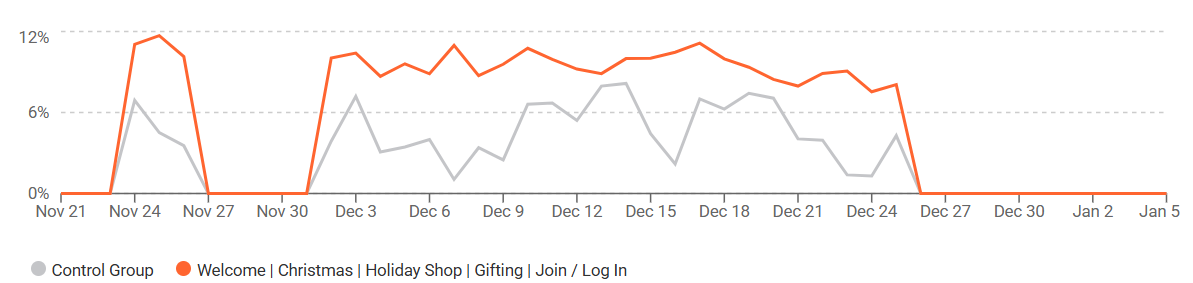
We tested this over several marketing campaigns to verify findings and found in general the personalized banner helped click through rate increase from 2-3% to 8-12%, with a +186% uplift for high intent users.
Depending on the campaign we saw a +9-17% uplift in revenue/session.
Click through rate

Banner vs. Banner with Product Display

Test
Does changing a marketing campaign banner layout to one with products next it increase revenue?
Outcome
The banner with products displayed next to it drove improved metrics across the board:
+117K incremental revenue
+2.6% revenue/user uplift
+4.75% revenue uplift from add to carts, suggesting that once users added items to their cart, they either bought more items, spent more per transaction, or converted at a higher rate than the control group.
+6.15% uplift to pageviews/user for desktop and +10.5% uplift for mobile.
Product Carousel Placement & Type
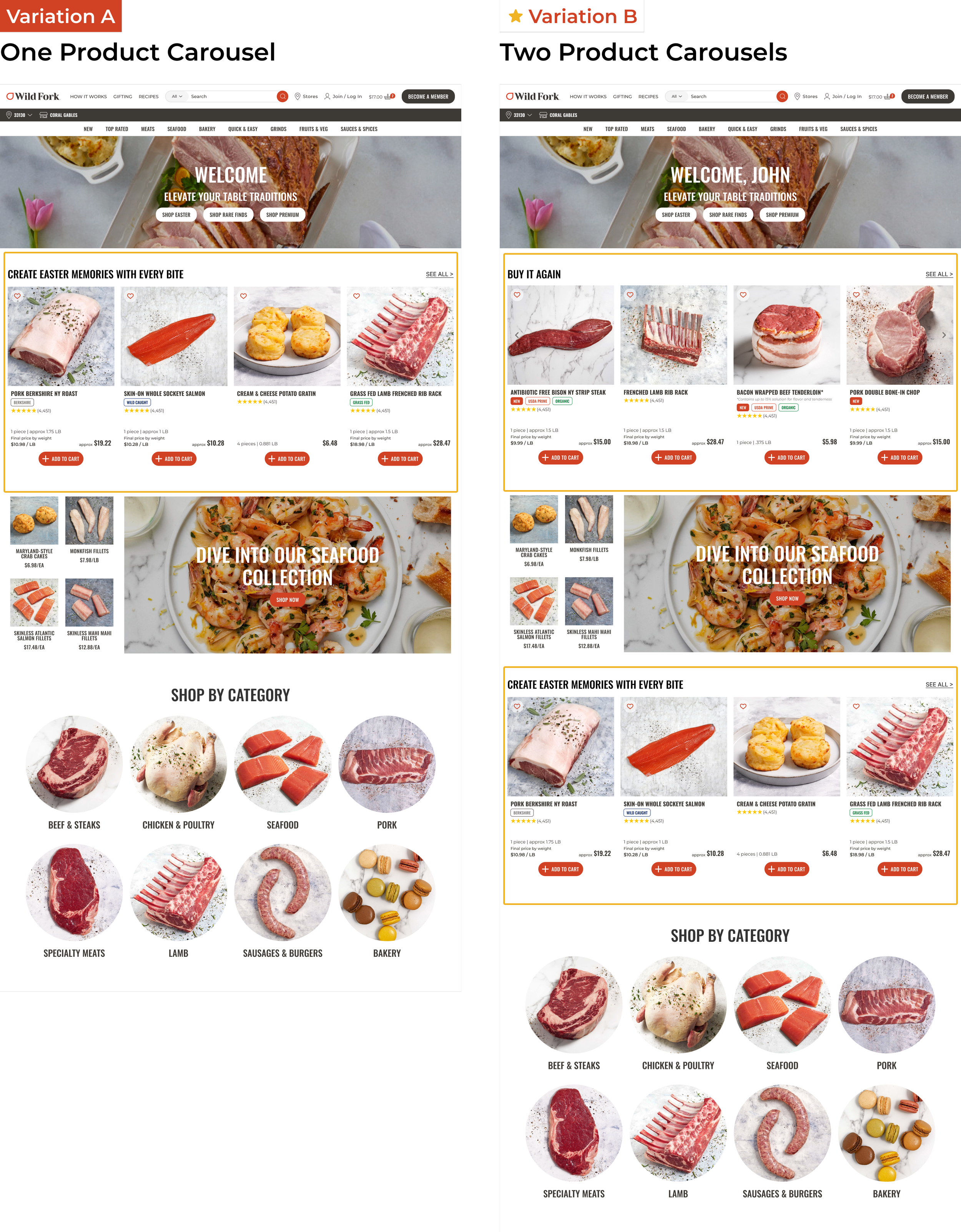
Test
Does placing "Buy It Again" first outperform "Trending Now" in increasing conversions? Does having more than one product carousel increase revenue?
Outcome
"Buy It Again" resulted in higher click-through rates and repeat purchases among existing customers.
Navigation vs. Marketing Focus
Test 1

Test 2

Test
Should the homepage prioritize category links at the top or start with marketing campaigns?
Outcome
Navigation-first layouts increased CTRs, but campaigns further down still drove discovery.
Key Outcomes
New Users
-
Improved clarity of Wild Fork’s offerings,
leading to higher engagement with "How It Works" content.
-
Higher conversion rate after adjusting category placement,
as users explored products at the right stage.
-
Optimized content order increased time-on-page,
helping users build confidence before making a purchase.
Returning Users
-
10% reduction in bounce rates,
as users engaged faster with relevant content.
-
Higher engagement on personalized banners,
leading to stronger user retention.
-
Increased click-through rates on product recommendations,
especially on the “Buy It Again” product carousel.
-
+649K in direct revenue and $3M in assisted revenue
from targeted product recommendations over w alone.
Final Designs