Enhancing Product Selection:
A/B Testing Product Option Selectors for a Better Shopping Experience
Wild Fork is an eCommerce site specializing in high-quality meat and seafood, averaging 39K sessions daily. They offer a range of products from budget-friendly options to premium cuts.

The Problem
Wild Fork’s product detail pages (PDPs) required users to navigate to separate pages to compare product variations (e.g., ribeye steak grade and type). This added friction to the shopping experience, making it harder for customers to find and purchase the exact product they wanted.
We hypothesized that adding product option selectors directly on the PDP would streamline decision-making, improving add-to-cart rates (ATC) and average order value (AOV)—especially for users with lower purchase intent.
The Goal
The primary objective of this test was to determine if displaying product variations (grade, grass-fed, etc.) directly on the PDP would:
✅ Increase ease of selection and reduce user frustration.
✅ Boost add-to-cart rates by simplifying product comparison.
✅ Drive higher AOV by encouraging users to explore premium selections.
Additionally, we wanted to understand how users felt about this new experience through an in-experience Qualtrics survey.
Target User
Online meat and seafood purchasers
Tools
Hotjar, Figma, Dynamic Yield, Qualtrics
My Contributions
As the lead UX Designer, I was responsible for:
Research & Strategy: Identifying user friction in PDP navigation and defining key test objectives.
A/B Testing & Experimentation: Designing and implementing product option selector tests in Dynamic Yield (DY) across multiple variations.
User Feedback Collection: Deploying a Qualtrics survey to gather qualitative insights from users who engaged with the new PDP experience.
Iterative Design & Optimization: Running follow-up A/B tests to refine button styles (stacked vs. scrolling) and formats (button with image vs. plain button).
Stakeholder Communication: Presenting findings to leadership and collaborating with the eCommerce team to implement winning designs.
Process
-
Research & Insights
User Interviews & Hotjar Data: Identified key behavioral differences between new and returning users.
Competitive Analysis: Researched industry best practices for homepage personalization.
Dynamic Yield: Worked with the team to better understand best practices surrounding personalization to this scale and dig in to case studies to comprehend how to best implement this strategy.
-
A/B Testing Approach
Content Hierarchy: Tested different orders of homepage sections (e.g., marketing vs. product-focused).
Messaging Personalization: Compared a generic marketing message vs. a personalized welcome banner for returning users.
Product Recommendations: Evaluated the impact of different carousels (e.g., "You May Also Like" vs. "Trending Now").
Visual Adjustments: Adjusted layout and CTA placements to enhance navigation and engagement.
-
Implementation & Iteration
Analyzed test results for impact on click-through rates, AOV, revenue, and bounce rates on a user intent level.
Refined homepage variations based on data-driven insights before finalizing the design, applying findings to the different audiences for personalized experiences.
A/B Tests
Phase 1: Product Option Selector Placement & Functionality

“So much easier to find and BUY things! 😊”
“I like being able to toggle to the specific type of meat grade I’m looking for on the same page. Nice upgrade!”
Test Overview
We tested three variations against a control (no selector):
Control: No product option selectors.
Hide/Show Available Options (Winning Variant): Only compatible selections were shown (e.g., choosing “Organic” would automatically filter USDA Choice).
Disabled Options: All selections were displayed, but unavailable combinations were grayed out.
Findings
Hide/Show Available Options won as the clearest option.
Low Intent Users: ATC +23.96%, Revenue +22.6%
Premium Users: AOV +9.74% (indicating they traded up or found premium options more easily)
Survey Overview
Users who landed on one of these pages were prompted with a popup survey to gather feedback on this feature.
Objective
Assess the ease of selecting a ribeye steak on the product detail page and identify potential usability improvements.
Sample Size
Total responses: 996 participants
“Smart to group the steaks by type of cut and then we can select the grade we want...much easier to see what's available/what the cut options are.”
Survey Findings
78.1% of users rated the experience 8/10 or higher, indicating strong usability.
494 users (49.6%) rated it a 10 (very easy)
141 users (14.2%) rated it a 9
143 users (14.4%) rated it an 8
The remaining 21.9% rated it a 7 or below, highlighting opportunities for refinement.
The high percentage of positive ratings suggests the selector is intuitive for most users.
“I love the grade selector!”
Phase 1: Product Option Selector Placement & Functionality

Test Overview
We tested three variations against a control (no selector):
Hide/Show Options (Winning Variant): Only compatible selections were shown (e.g., choosing “Organic” would automatically filter USDA Choice).
Disabled Options: All selections were displayed, but unavailable combinations were grayed out.
Control: No product option selectors.
Findings
Low Intent Users: ATC +23.96%, Revenue +17.42%
Premium Users: AOV +9.74% (indicating they traded up or found premium options more easily)
Survey Results: 76% of users rated the experience 8/10 or higher
“So much easier to find and BUY things! 😊”
“I love the grade selector!”
“Smart to group the steaks by type of cut and then we can select the grade we want...much easier to see what's available/what the cut options are.”
“I like being able to toggle to the specific type of meat grade I’m looking for on the same page. Nice upgrade!”
Phase 2: Button Style Optimization

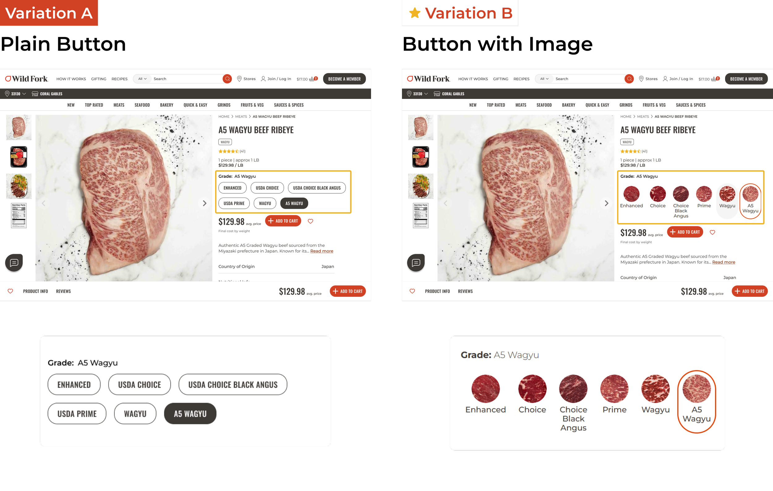
Test Overview
We iterated on the product option selector UI to refine its usability first testing Scrolling Buttons vs. Stacked Buttons (Winner: Stacked) for mobile.
Test Overview
We iterated on the product option selector UI to refine its usability:
Button with Image vs. Plain Button (Winner: Plain Button)
Findings
Stacked buttons performed better, as users found scrolling cumbersome.
Findings
Image buttons outperformed plain buttons, likely due to easier marbling comparison with the visuals.
Best results for tablet users
+34.37% purchase revenue/user
+26.4% add to cart/user
+9.63% add to cart revenue
+25.76% AOV
Mobile users also saw great results
+8.15% purchase revenue/user
+5.33% add to cart/user
+7.77% add to cart revenue
+2% AOV
Key Outcomes
New Users
-
Faster product selection,
reducing page navigation friction.
-
Greater clarity in product comparison,
helping decision-making.
-
Improved engagement,
leading to a sustained increase in conversions.
Returning Users
-
Add to cart rates increased by 23.96%
for low-intent shoppers.
-
Higher AOV (+9.74%)
for premium shoppers, indicating better product discovery.
-
Improved user experience,
as reflected in 78% positive survey feedback.
Final Designs
Next Steps
-
Refining Grade Education:
Add a visual chart explaining steak grading to assist first-time buyers.
-
Exploring More Selector Enhancements:
Investigate additional improvements, such as thickness selection.
-
Expanding to More Products:
Roll out product option selectors across a wider range of meats based on these findings.